Ryze - Project Overview & Starter Guide
Introduction
Ryze is a modern, content-first and responsive Astro template built to be small, fast, and scalable. This guide gives you a no-nonsense reference on what Ryze provides out of the box, how to run it locally, and where to make common edits.
See the SOURCE CODE for more details.
What Ryze ships
- Astro v5: server-side-compiled static pages and components. Astro renders to static HTML by default, so pages load fast and ship zero JS unless using islands.
- Tailwind CSS v4: utility-first styling with theme and typography changes by extending colors, spacing, font-family and more. Mobile first responsive design baked in.
- React integration & Typescript support: use React hooks to build custom components for client-side interactivity when needed. Typescript enabled for type safety.
- Markdown Blogs: markdown files with frontmatter for metadata, consumed by the dynamic blog route(s) using the Content Collection API. Supports components in MDX if needed.
- Shiki syntax highlighting and themes: beautiful, performant code blocks with a variety of themes. Supports multiple languages and custom styling.
- SEO and editorial features: meta tags, OG graph, robots.txt, RSS, sitemap integration, featured blogs and tags along with year-base categorization.
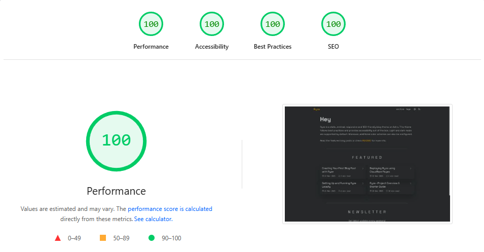
Lighthouse Performance Scores
Technologies Used
Astro Framework
Astro is a modern web framework optimized for content-driven sites.
Island Architecture (High-Level Explanation)
Traditional web frameworks send all your JavaScript to the browser. Astro uses “Islands Architecture”—think of your page as mostly static HTML with small interactive “islands” of JavaScript.
For example:
- Static: Blog post content, headers, footers → rendered as HTML
- Interactive: Theme toggle, comment form → ships minimal JavaScript
This hybrid approach gives you the best of both worlds. SEO benefits of static sites with interactivity where you need it.
Static Site Generation
Astro generates your entire site at build time into static HTML.
This means:
- Ultra-fast: Serve pre-built HTML instead of computing on each request
- Secure: No server-side code execution, no databases to protect
- Scalable: Deploy anywhere - static hosting, CDNs, even S3
- Eco-friendly: Less computational overhead
Tailwind CSS
Instead of writing custom CSS, Tailwind provides a comprehensive set of pre-defined utility classes.
<!-- Before: Write custom CSS -->
<style>
  .card {
    padding: 1.5rem;
    border-radius: 0.5rem;
    background-color: white;
    box-shadow: 0 1px 3px rgba(0, 0, 0, 0.1);
  }
</style>
<div class="card">...</div>

<!-- After: Compose utilities -->
<div class="rounded-lg bg-white p-6 shadow-md">...</div>
Customization Possibilities
- Extend color palettes with your brand colors
- Adjust spacing, typography, and breakpoints
- Add custom utilities for frequently-used patterns
- Configure plugins for extended functionality
Everything from light mode to dark mode theming is configurable without leaving your config file.
Markdown Content System
MD/MDX Files
Write your content in Markdown, the human-friendly markup language. Astro also supports MDX, which lets you embed React or Vue components directly in your markdown:
---
title: "Interactive Blog Post"
---

This is regular markdown.

<InteractiveCounter client:load />

More markdown below the component.
Frontmatter Metadata
YAML frontmatter at the top of your markdown files stores metadata.
---
title: "Post Title"
description: "What's this about?"
date: 2025-11-19
author: "Your Name"
tags: ["tag1", "tag2"]
featured: true
editable: false
---
This metadata is parsed and available to your layout templates, enabling automatic sorting, filtering, and organized content management.
Project Structure
Ryze
├── public/
│   └── favicon.svg
│
├── src/
│   ├── assets/
│   │   └── ... (static assets like fonts, icons)
│   ├── blog/
│   │   ├── post-title.md
│   │   ├── another-post.md
│   │   └── ... (add your posts here)
│   │
│   ├── components/
|   |   ├── CopyButton.astro
│   │   ├── FeatureCard.astro
│   │   ├── Featured.astro
│   │   ├── Footer.astro
│   │   ├── Header.astro
│   │   ├── Introduction.astro
│   │   ├── Navigation.astro
│   │   ├── Newsletterastro
│   │   ├── Pagination.astro
│   │   ├── PostCard.astro
│   │   ├── ProgressBar.tsx
│   │   ├── Seo.astro
│   │   ├── Socials.astro
│   │   ├── ThemeToggle.tsx
│   │   ├── Title.astro
│   │   └── Year.astro
│   │
│   ├── layouts/
│   │   ├── BaseLayout.astro
│   │   └── BlogLayout.astro
│   │
│   ├── pages/
│   │   ├── index.astro
│   │   ├── [...slug].astro
│   │   ├── 404.astro
│   │   ├── rss.xml.ts
│   │   ├── robots.txt.ts
│   │   ├── archive/
│   │   │   ├── [page].astro
│   │   │   └── [year]/[page].astro
│   │   └── tags/
│   │       ├── index.astro
│   │       └── [tag]/[page].astro
│   │
│   ├── styles/
│   │   ├── global.css
│   │   └── typography.css
│   │
│   └── content.config.ts
│
├── .gitignore
├── .prettierrc
├── astro.config.mjs
├── tsconfig.json
├── eslint.config.js
├── package.json
├── LICENSE
└── README.md
Overview of Key Directories & Files
Clean Folder Structure
The starter uses a thoughtful organizational system:
- src/pages: Routes in Astro-file and folder names automatically become URL paths
- src/layouts: Reusable page templates for consistency across your site
- src/components: Modular UI pieces that you can combine to build pages
- src/blog: Markdown content files with structured metadata
- src/assets: Static content images and fonts used across the site
This structure scales beautifully. Whether you have 5 pages or 500, everything stays organized and maintainable.
Extendable Layouts
Layouts are template files that wrap your content. Need a different design for blog posts vs. landing pages? Create a new layout, define it in your file’s frontmatter, and you’re done.
Layouts support nesting, so you can create BaseLayout → BlogLayout → SpecializedBlogLayout chains without code duplication.
Root Level Files
astro.config
This is Astro’s configuration file.
Here you can:
- Configure plugins and integrations like Tailwind CSS, React and Sitemap
- Add custom vite configuration
- Add custom shiki themes or transformers
- Define output and build options
- Set your site URL for SEO
// @ts-check
import { defineConfig } from "astro/config";
import tailwindcss from "@tailwindcss/vite";
import vitePluginSvgr from "vite-plugin-svgr";
import react from "@astrojs/react";
import sitemap from "@astrojs/sitemap";

// https://astro.build/config
export default defineConfig({
  vite: {
    plugins: [tailwindcss(), vitePluginSvgr({})],
  },
  devToolbar: {
    enabled: false,
  },
  integrations: [react(), sitemap()],

  markdown: {
    shikiConfig: {
      defaultColor: false,
      themes: {
        light: "github-light-high-contrast", // one-light
        dark: "github-dark", // plastic
      },
      wrap: true,
    },
  },

  prefetch: {
    prefetchAll: true,
    // defaultStrategy: "load",
  },

  output: "static",
  site: "https://ryze.pages.dev",
});
package.json
Helps you manage and maintain your project’s dependencies and npm scripts.
{
  "name": "ryze",
  "scripts": {
    "dev": "astro dev",
    "build": "astro build",
    "preview": "astro preview"
  },
  "dependencies": {
    "astro": "^latest",
    "tailwindcss": "^latest"
  }
}
Run npm run dev to start development, npm run build to create dist.
src Directory
layouts
Base Layout
The foundation layout used by most pages, extending it for specific needs.
Includes:
- HTML structure and head tags for SEO optimized pages (meta, fonts, favicons)
- Header and navigation including theme toggle and rss
- Footer including social links and copyright
- Main content container with max-width and padding
- Global and typography styles
---
export interface Props {
  title: string;
  description: string;
  author: string;
  url: string;
  pubDate?: Date;
}

import "@fontsource-variable/space-grotesk";
import "@fontsource/ibm-plex-mono";
import Seo from "../components/Seo.astro";
import Header from "../components/Header.astro";
import Footer from "../components/Footer.astro";
import "../styles/global.css";
const { title, description, author, url, pubDate } = Astro.props;
---

<!doctype html>
<html lang="en" dir="ltr">
  <head>
    <meta charset="UTF-8" />
    <meta name="viewport" content="width=device-width" />
    <link rel="icon" type="image/svg+xml" href="/favicon.svg" />
    <meta name="generator" content={Astro.generator} />
    <Seo {title} {description} {author} {url} {pubDate} />
    <script is:inline>
      const saved = localStorage.getItem("theme");
      const prefersDark = window.matchMedia(
        "(prefers-color-scheme: dark)",
      ).matches;
      document.documentElement.classList.add(
        saved || (prefersDark ? "dark" : "light"),
      );
    </script>
  </head>
  <body class="body-margin">
    <Header />
    <main class="main-margin bg-background relative z-1 min-h-svh">
      <slot />
    </main>
    <Footer />
  </body>
</html>
Blog Layout
Specialized template for blog posts.
Includes:
- Meta tags for SEO (title, description, OG tags) based on frontmatter
- Reading Progress Bar
- Blog header component which renders blog title, date, read time and attached tags
- Table of contents (optional)
- Main content area wrapped with tailwind typography styles
---
import ProgressBar from "../components/ProgressBar";
import BaseLayout from "./BaseLayout.astro";
import Title from "../components/Title.astro";

const { frontmatter, readTime } = Astro.props;
---

<BaseLayout
  title={frontmatter.title}
  description={frontmatter.description}
  author={frontmatter.author}
  url={`https://ryze.pages.dev/${frontmatter.slug}`}
  pubDate={frontmatter.date}
>
  <ProgressBar client:load />
  <article>
    <div class="center">
      <Title frontmatter={frontmatter} readTime={readTime} />
      <section class="markdown">
        <slot />
      </section>
    </div>
  </article>
</BaseLayout>
components
Header
Navigation bar component (fixed top).
Includes:
- Site/Brand name or logo
- Navigation menu
- Theme toggle button (react island)
- RSS feed link
---
import ThemeToggle from "./ThemeToggle";
import Navigation from "./Navigation.astro";
import { IconRss } from "@tabler/icons-react";
---

<header>
  <a
    href="/"
    class:list={[
      "text-xl tracking-wider select-none",
      Astro.url.pathname === "/" ? "text-accent" : "",
    ]}>Ryze</a
  >
  <div class="flex items-center justify-center gap-6">
    <Navigation />

    <div class="flex items-center justify-center gap-4">
      <ThemeToggle client:load />
      <a href="/rss.xml" aria-label="rss" title="rss">
        <IconRss className="active-foreground size-5" />
      </a>
    </div>
  </div>
</header>
Footer
Website wide footer (fixed bottom).
Includes:
- Copyright information
- Social media links
- Credits section
---
import Socials from "./Socials.astro";
---

<footer>
  <Socials />
  <div>
    <p>© 2025 MIT License</p>
    <p>
      powered by <a
        href="https://astro.build"
        target="blank"
        class="hover:text-accent"
        aria-label="astro site">Astro</a
      > &
      <a href="" class="hover:text-accent" aria-label="Ryze site">Ryze</a>
    </p>
  </div>
</footer>
PostCard
A reusable component for displaying blog post information in card format with title, date, tags and link to full post.
---
import { IconArrowRight } from "@tabler/icons-react";

const { title, date, url, tags } = Astro.props;
---

<a href={url}>
  <div class="mx-4 mt-2 flex items-center justify-between gap-6">
    <div class="flex items-center gap-3">
      <h3>
        {title}
      </h3>
    </div>
    <div class="flex">
      <p>{date}</p>
      <IconArrowRight />
    </div>
  </div>
  <div>
    <div class="mx-3 flex flex-wrap">
      {tags.map((tag: string) => <p>{tag}</p>)}
    </div>
  </div>
</a>
SEO-Friendly Setup
Meta Tags
The theme includes a dedicated SEO component that handles:
- Open Graph tags for social media previews
- Twitter Card tags for better sharing
- Canonical URLs to prevent duplicate content issues
- Structured data for search engines
- Dynamic title and description generation
Simply define your metadata in frontmatter, and the system generates proper HTML.
---
title: "My Blog Post"
description: "A brief summary for search results"
date: 2025-11-20
author: "Rahul"
---
Sitemap + RSS
Automatic sitemap generation helps search engines crawl your entire site. RSS feeds allow readers to subscribe to your content using their favorite readers. Both are generated automatically, no configuration needed.
Responsive Design with Tailwind
Mobile-First Approach
Every component in this template is designed to be mobile responsive. This means we design for small screens, then add enhancements for larger screens. The result is a site that works beautifully everywhere.
Use Tailwind’s responsive prefixes to adapt your layout:
<div class="flex flex-col md:flex-row lg:flex-row-reverse">
  <!-- Mobile: column layout, Tablet+: row layout, Desktop: reversed row -->
</div>
Utility Class Structure
Tailwind’s utility-first approach means you build designs by composing small, reusable classes.
<button
  class="rounded-lg bg-blue-600 px-4 py-2 text-white transition-colors hover:bg-blue-700"
>
  Click Me
</button>
You can look through some of the custom tailwind classes for this template in src/styles/utility.css. For markdown typography styles, see src/styles/typography.css.
The starter is designed to be your foundation, not your limitation. Extend it, modify it, and make it your own. Happy building!